Best practices for creating an impact dashboard you and your team will love
Introduction
Dashboards help data-driven social impact leaders make faster, smarter decisions. But how do you make sure your dashboard includes the right information to help you answer your unique business questions?
Let’s think about how dashboards can (and should) fit into your decision-making process by looking at best practices for layout and visualization specifically for measuring social and environmental impact.
Best practices for creating a social impact dashboard you and your team will love
Dashboards vs. reports
When many people think of impact reporting, they think of reports - tables or spreadsheets with rows and columns including key data points. For example, in a donations report, each row might be a single donation, and each column might be a key field such as donation amount, the nonprofit name, the nonprofit’s EIN, the donor’s email address, etc. While reports are very useful ways to see detailed line item data, they do not enable viewers to quickly see key insights and information.
Dashboards are a more visual approach to reporting, in which the data is shown in more visual ways, such as charts and graphs, so that audiences can track trends and draw insights. With Deed’s data offering, impact leaders can actually download the data behind a dashboard in a report format, so that you can see both the visual and line item representation of the data! Dashboards are a great tool for impact leaders to track the impact of their initiatives, align with their team, and share their findings.
Dashboard layout
As with any document that is intended to be read, layout of the dashboard “page” is important. Placing key metrics at the top, using section headings, and including page breaks (as relevant) are all ways to ensure that the dashboard is easy to follow.
Types of data visualizations for social impact
The types of data visualizations you use in the dashboard have a significant impact on how easily audiences can “read” the dashboard. A key indicator of a successful dashboard is that audiences can look at the dashboard and easily see important metrics and draw insights from the charts, graphs, and other data visualizations used.
Data visualizations can also help effectively communicate impact. Using the wrong data visualization can confuse audiences, muddle the takeaway, and worst case, cause audiences to have the wrong takeaway. Let’s look at several types of data visualizations and when to use them.
Single value
Single value visualizations are typically used to display a key performance indicator (KPI). These visualizations are a single number, such as total donations, total volunteer hours, number of donors, number of nonprofits reached, etc. They give readers a snapshot of important impact metrics at a moment in time.

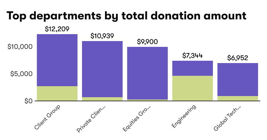
Bar chart
Bar charts are typically used to compare values across categories or groups of data. For example, you might want to see the total amount donated by each department within your company, or how many hours were volunteered by each cause area.
Bar charts are a great way to show rankings (e.g., which department had the highest donations). There can also be another dimension added to a bar chart, by breaking each bar into sub groups. For example, if each bar is a department within your company, the bars may have different colors stacked within them to represent each team’s donations within that department.
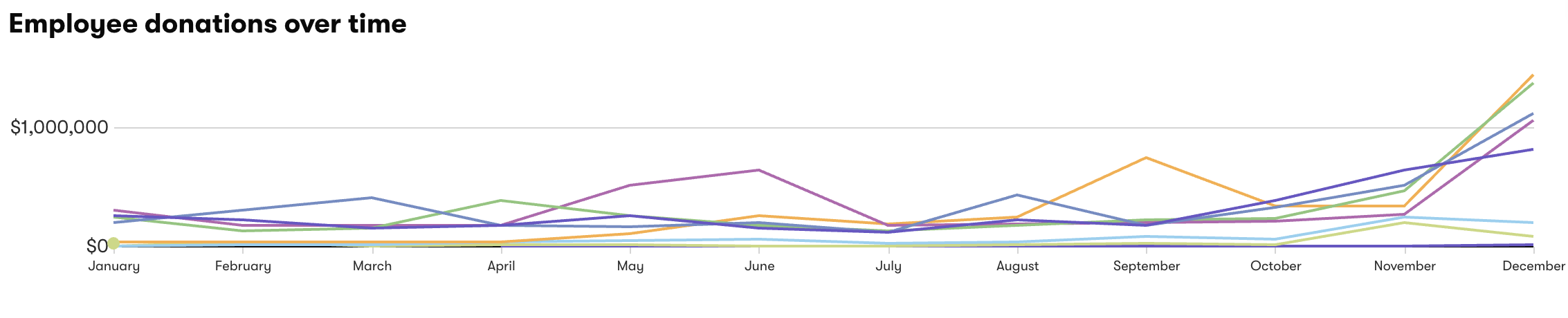
Line graph
Line graphs are typically used to show how values change over time. For example, you might want to see how volunteer hours change month over month throughout the year. Line graphs can have only one line (e.g., just the line for this year) or multiple lines.
If you were to have multiple lines in the monthly volunteering line graph—one line representing each year—then you would be able to see if there are patterns each year for months with higher or lower volunteer hours. This information could be helpful as you think through when to host the next volunteer initiative—if summer is a slower time for volunteering, wait until employees are back in September for the company’s big volunteer day!
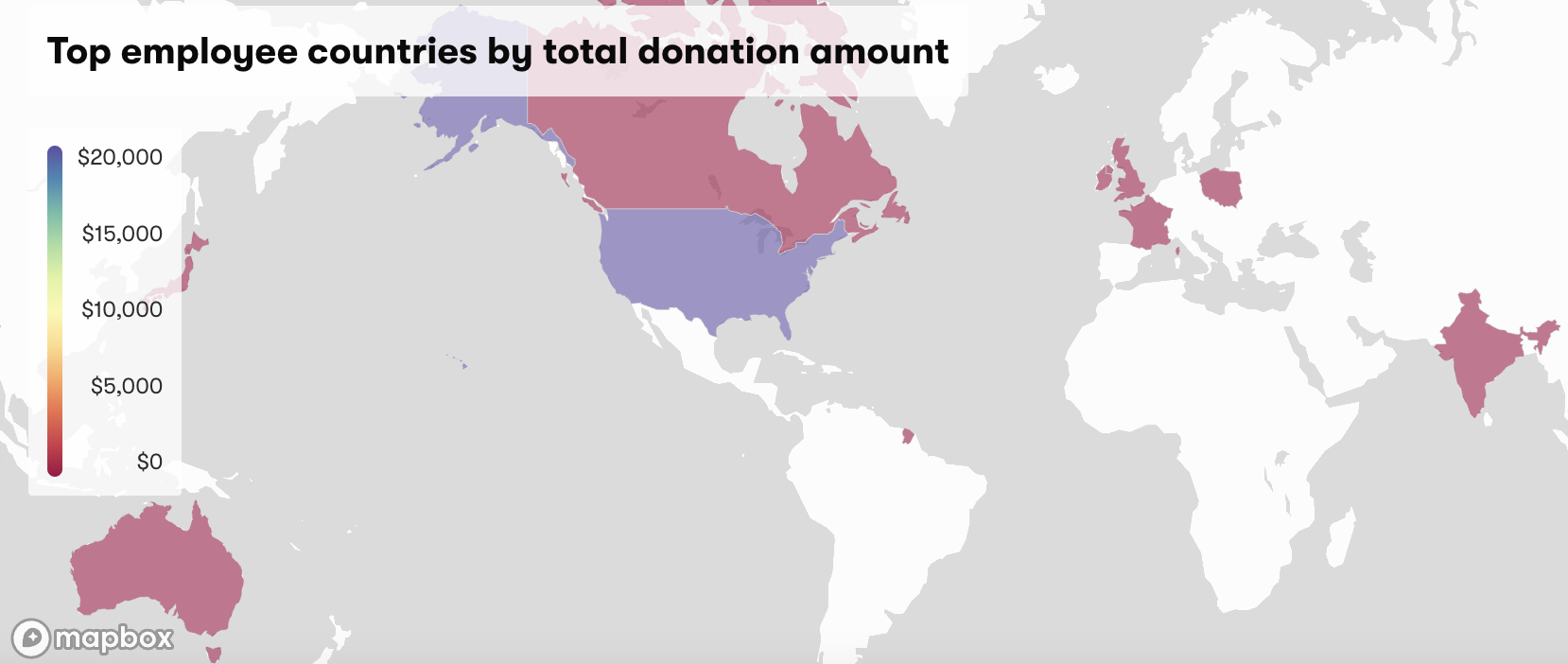
Heat map
Heat maps are typically used to show the concentration of a behavior or finding within geographical boundaries. Heat maps can use the same color in different shades (e.g., for a country or state with a higher concentration of employees who donated, the color may be darker). They might also use a color spectrum (e.g., for a country or state with a higher concentration of employees who volunteered, the color may be green, whereas for a lower concentration of volunteers, the color may be red). In a dashboard with many charts and graphs, a heat map can be a great way to portray the data, making it more scannable and intuitive.
Table
Even a standard table can be part of a dashboard. If there are several pieces of information that you want to show all in one place, a table may be the best way to do so.
For example, if you want to show engagement across the five nonprofits that are part of your company’s annual impact campaign, you might want to show how many dollars were donated, how many hours were volunteered, and how many employees participated. Having that information spread across a number of charts or graphs could make it difficult to get the quick read that you want, and a table might be the best approach.
For example, the nonprofit with the highest total donations is automatically highlighted green so that it stands out. Just keep in mind that a dashboard should be geared toward quick takeawaysso don’t add too many columns in a dashboard table.
Conclusion
Airbnb and lululemon democratize social impact by empowering their teams to use data to make decisions regardless of their quantitative expertise. If you are inspired by that modern approach to employee engagement in social impact, then you should always carefully consider your dashboard layout and data visualizations. Remember: The goal is to create a valuable tool for your whole team.
Deed is an enterprise social impact platform that helps Airbnb, lululemon, and a growing community of Fortune 500 companies create intuitive, useful impact dashboards. We started as a viral volunteering app, and today our platform gives the world’s most inspiring brands one exceptionally-designed home for all of their purpose-driven activities.
Corporate grantmaking, employee donations/matching, diversity & inclusion, and employee resource groups (ERGs) are only the beginning. Because over the past three to five years, everyone’s expectations for Fortune 500 corporate social responsibility have radically changed. But with our trusted integration partners like Workday and PayPal, hand-in-hand customer service, and a collaborative product team, Deed’s platform moves at the speed of work.
Ready to put data at the center of your social impact decision-making process? Reach out now.